krisztiqqiao@gmail.com
christyqiao © 2026


menu
close
.webp)
Semi-structured Interviews with users
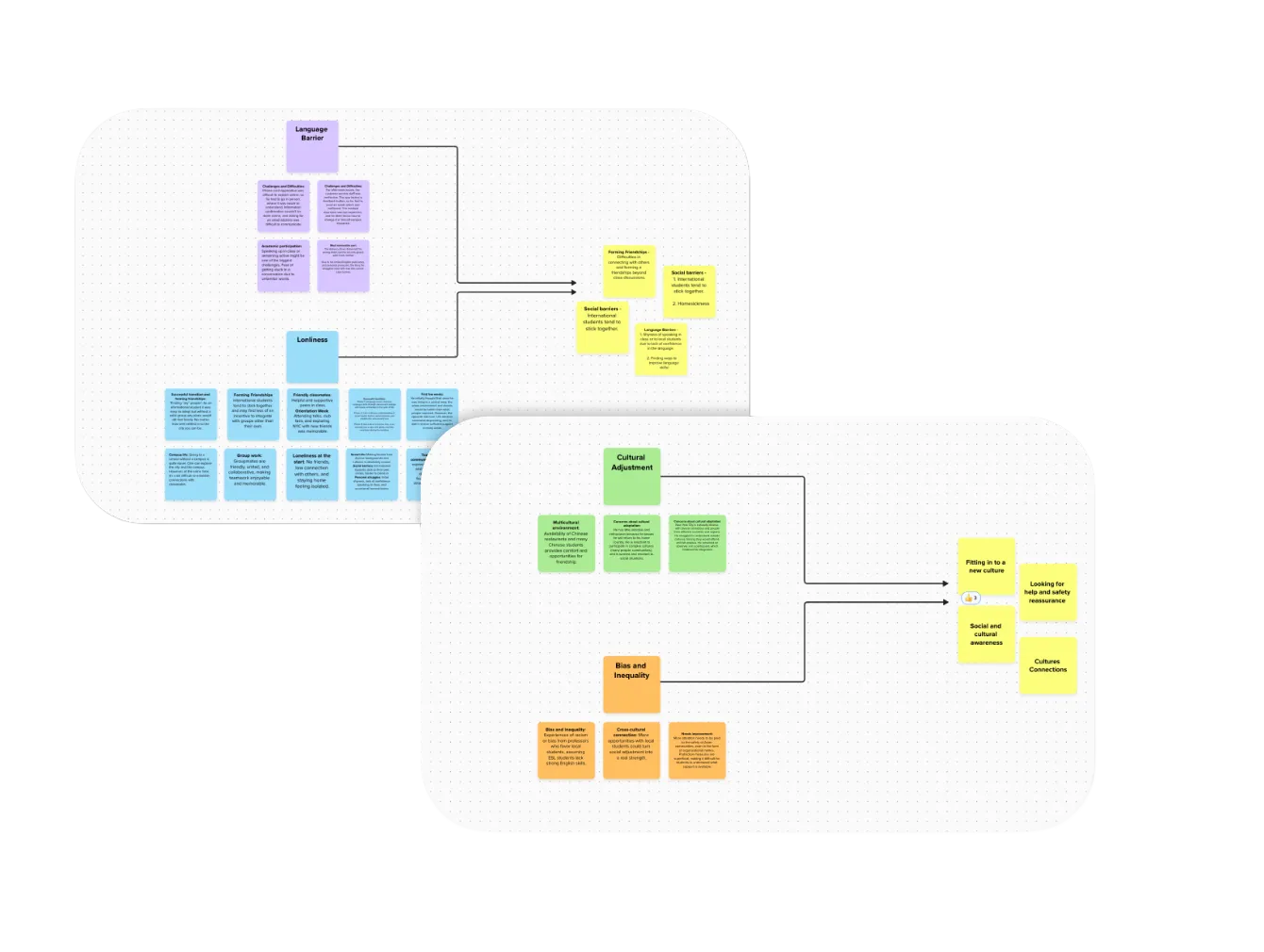
As a team, we conducted 10 semi-structured interviews with users who matched our target profile. I independently led and analyzed 4 of these interviews, focusing on uncovering user needs, behaviors, and pain points.
This approach allowed us to identify recurring themes and patterns across participants, which directly informed our problem framing and design direction.
%20(1).webp)
Seven distinct categories emerged from our research
Three core themes emerged across interviews and surveys
Connection &
Belonging
Students struggle to build confidence and meaningful connections beyond familiar cultural groups.
Access &
Navigation
Students struggle to build confidence and meaningful connections beyond familiar cultural groups.
Safety &
Stability
Students struggle to build confidence and meaningful connections beyond familiar cultural groups.
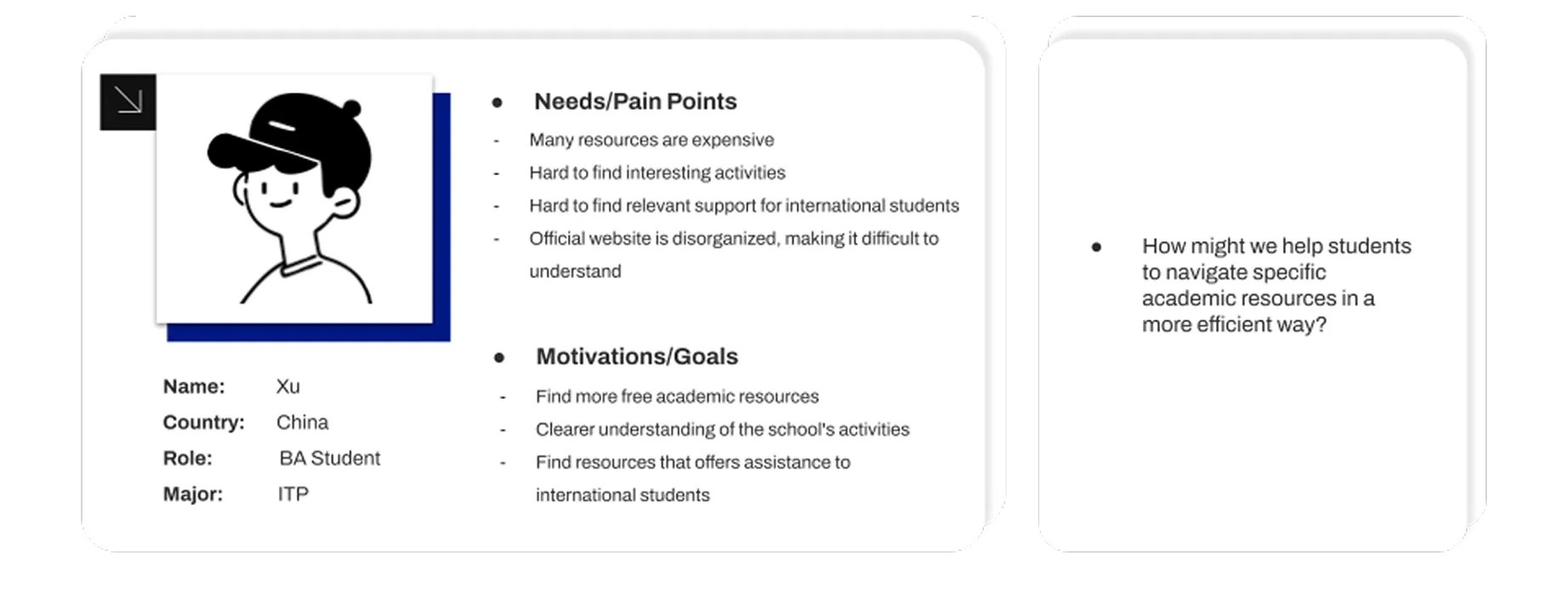
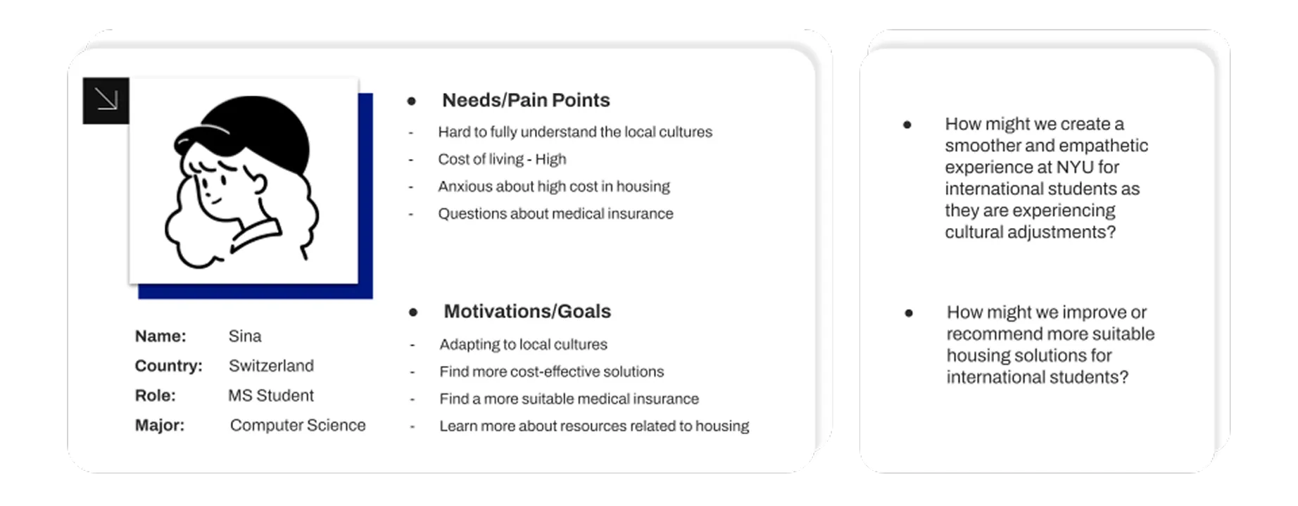
Designing for multiple student experiences
Drawing from both qualitative interviews and surveys, we created three personas reflecting common student challenges. We paired each persona with How Might We questions to reframe pain points into actionable design prompts and align the team on where to intervene.
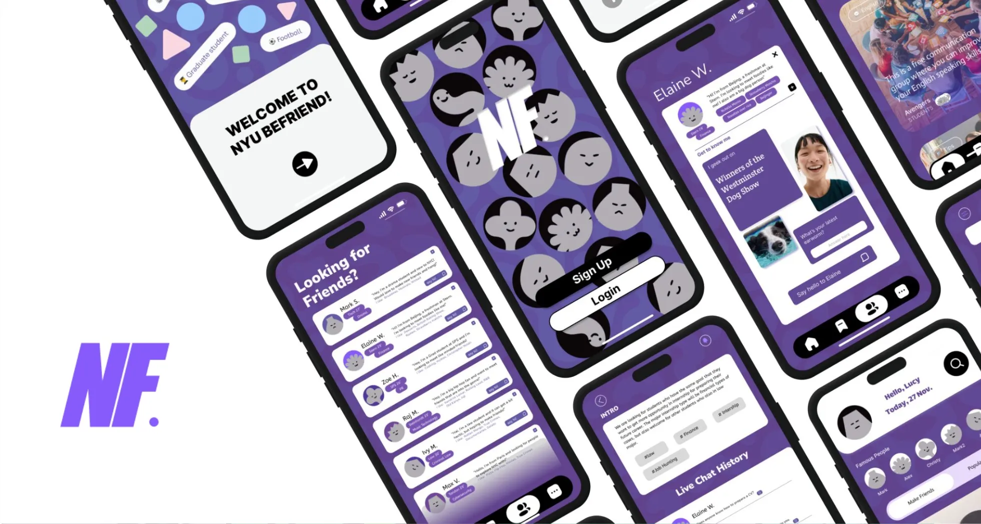
Designing a hub for meaningful connections
Guided by persona insights and How Might We questions, we designed a centralized hub to help international students form meaningful connections, discover communities, and navigate social interactions with confidence.
Find Friends
Helps students introduce themselves beyond surface-level profiles, making it easier to start conversations and reduce social anxiety.
Join Groups
Allows students to discover interest-based and goal-oriented groups, supporting networking, peer learning, and community building.
Shared Profiles &
Introductions
Encourages personal expression through lightweight prompts, helping students connect over common interests rather than small talk.
Conversation History &
Context
Provides continuity and social context, making it easier for new users to engage without feeling lost or intrusive.
Validating flow, clarity, and social comfort
To evaluate whether the app’s flow and features effectively supported meaningful connections, we conducted multiple rounds of usability testing with 5–6 international students.
Our focus was on identifying points of friction, understanding where users hesitated, and observing how comfortably they navigated social features without guidance. These sessions helped surface moments of confusion, cognitive overload, and social anxiety within the flow.
Reducing friction and lowering social barriers
Testing revealed that while users resonated with the concept, unclear navigation, visual density, and hidden interactions created hesitation especially in social contexts.
In response, we simplified the interface hierarchy, clarified navigation paths, and restructured social features to feel more approachable. Emphasizing progressive disclosure and clearer entry points helped users engage with others more confidently and intentionally.
Exploring structure before visual polish
Based on early insights, we created low-fidelity wireframes to explore onboarding, social discovery, and group interaction flows.
At this stage, we focused on information structure, interaction logic, and emotional comfort, rather than visual details, allowing us to quickly test assumptions and iterate on flow.
.webp)
Designing for social ease
Throughout sketching and wireframing, we repeatedly asked:
Through multiple iterations, we streamlined core flows and reduced decision pressure, making social interactions feel lighter, clearer, and more welcoming.
Final Prototype Walkthrough
This short walkthrough, presented by a teammate, introduces the final prototype and highlights the core features and interaction flow. It shows how users can discover designers, share style creations, and connect through intentional social discovery.
Designing for connection, not just features
Through usability testing with international students, we validated that the app helped lower the barrier to initiating social interactions and made discovering communities feel more approachable. Participants responded positively to the focus on guided discovery, shared interests, and low-pressure ways to connect.
Rather than feeling overwhelming, the experience felt intentional and supportive especially for students navigating language, cultural, and social uncertainty in a new environment.
Scoping intentionally to design with empathy
This project reinforced the importance of narrowing focus. By centering on international students and their lived experiences, we designed features that prioritize psychological safety, meaningful connection, and community. Designing for how users feel proved just as important as designing for what they can do.
This project was created in collaboration with a team of designers.
Thank you to my teammates Alex Ni, Shikuan Zhu, and Yichen Xiang for their contributions to research, ideation, prototyping, and the final walkthrough.
